

Locate the peak
See which day had the highest captured lead count.
Lead AnalyticsDaily leads
See which days brought captured leads during the selected month.
Take a closer look at one month
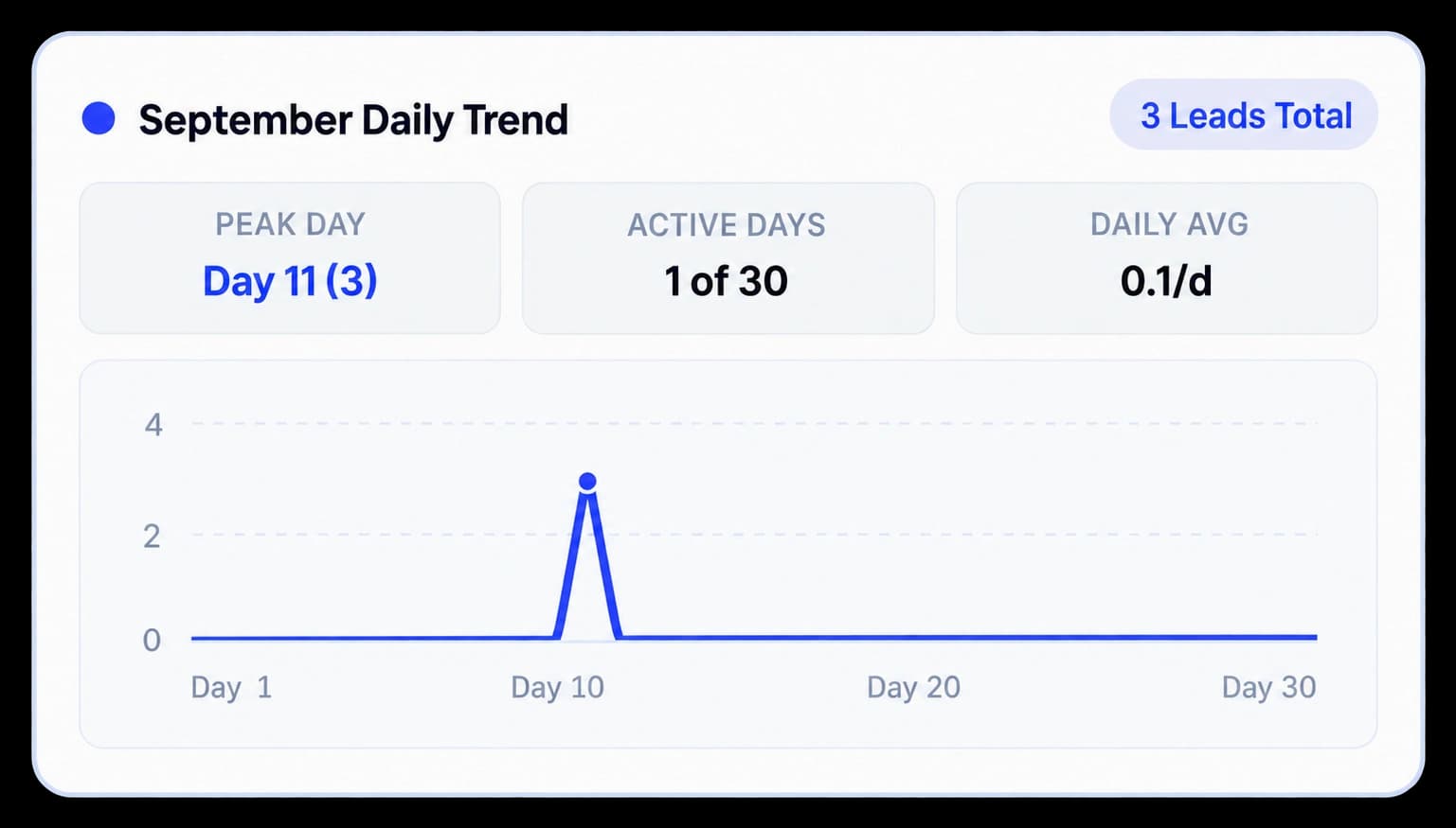
September Daily Trend breaks the selected month into days and summarizes its activity with Peak Day, Active Days, and Daily Avg. The line chart shows where leads appeared across the month.
See which day had the highest captured lead count.
Compare days with activity against the full month.
See the average count across the days in the selected month.
In the dashboard
The daily panel pairs a day-by-day chart with a small summary. In the supplied example, Day 11 is the peak with three leads, one of thirty days is active, and the daily average is 0.1.
Inside the workflow
Choose the month, read its summary, and follow the line to see how activity is distributed by day.
Select a month in the Captured Leads chart.
Review Peak Day, Active Days, and Daily Avg for the selected month.
Use the day labels to locate activity across the month.
Product video
Record the control, the change it makes, and the result on screen.
daily-engagement-trend-graphs.mp4Where it helps
Daily detail helps a team understand how a monthly lead total is distributed over time.
Sales teams
Product marketing
Workspace owners
A few useful details
It shows lead activity by day for the selected month, with Peak Day, Active Days, and Daily Avg summaries.
The screenshot example shows three leads on Day 11, activity on one of thirty days, and a daily average of 0.1. Your values depend on your workspace.
Yes. Selecting a month in Captured Leads updates the month’s daily trend.

Build interactive walkthroughs, personalize prospect links, and export 60 FPS motion videos without writing code or waiting on engineering.